
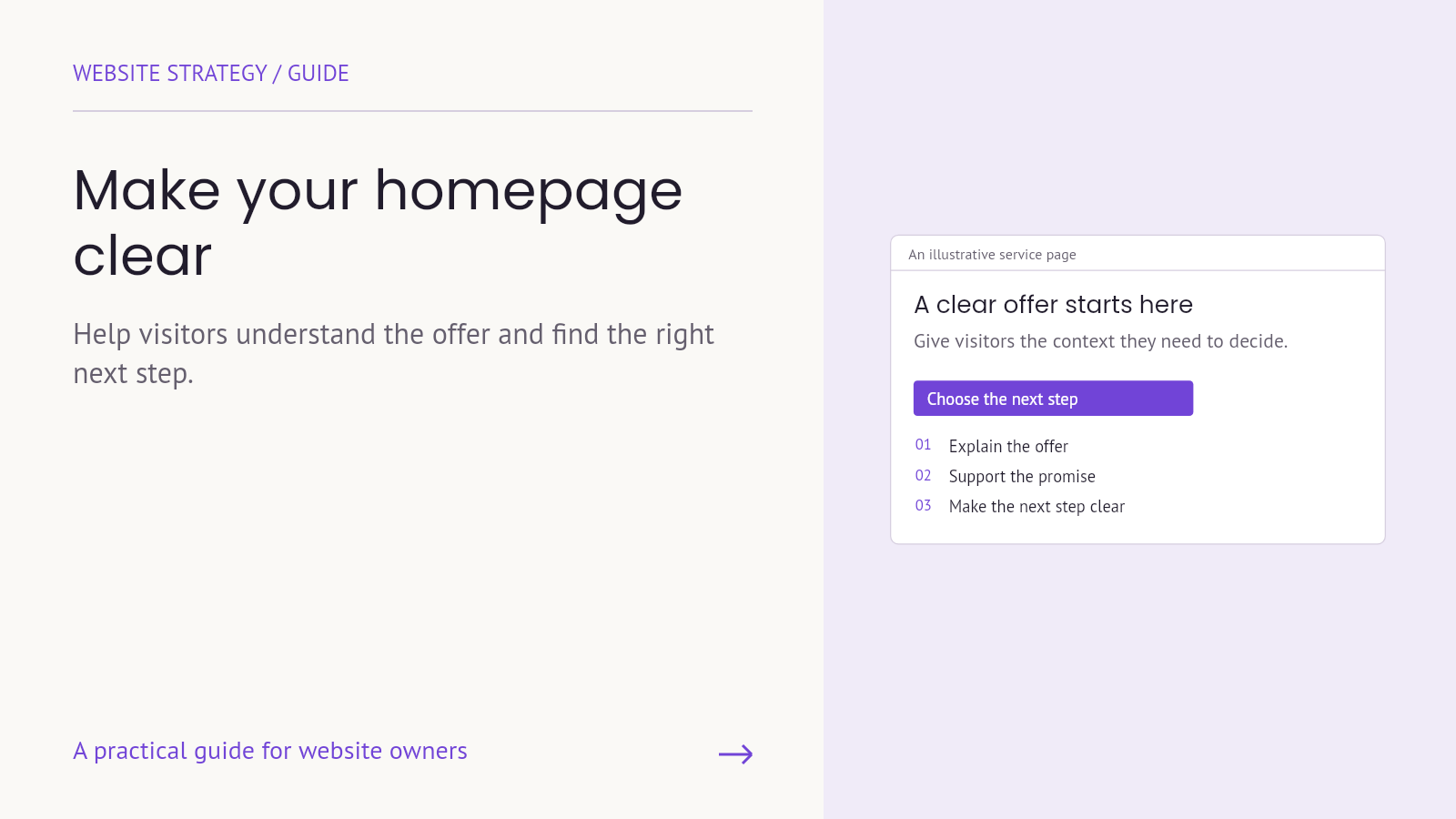
Your team already understands the business. A first-time visitor does not share that background. When a homepage relies on slogans, internal service names or unexplained claims, the reader has to supply the missing context before deciding where to go.
Homepage clarity means making that first decision easier: understanding what the company does, recognizing whether it is relevant and finding a useful next step. It does not require a page with almost no text. It requires information in a clear order, with enough detail to orient someone who is new to the business.
Start with the visitor’s questions
Choose an important audience and a realistic task. A prospective client evaluating a service needs a different route from an existing customer looking for support. The homepage can serve both, but those routes should be identifiable rather than competing for equal attention everywhere.
Before changing the design, ask someone outside the business to explain the offer and show where they would go next. Note the words they use and the points where they hesitate. This is a way to uncover questions, not proof that one person’s experience represents the entire audience.
1. Say what the company actually does
Review the headline and supporting sentence together. Can a visitor identify the service without decoding a metaphor? Does the opening provide enough context to judge relevance? Keep the brand voice, but do not ask it to replace an explanation.
Nielsen Norman Group’s guidance on website taglines emphasizes explaining a site’s purpose. A practical application is to name the service in recognizable language, then add the audience or useful outcome in the supporting copy.
For example, “WordPress support for service businesses” is more specific than “Digital possibilities, unlocked.” This is an illustrative writing comparison, not a claim that the same wording suits every company. Use language that accurately reflects your own offer.
2. Choose a primary next action
Decide which action deserves visual priority for the intended visitor. Depending on the business, that could be exploring services, requesting a quote or viewing products. Use a label that describes the destination or step.
Secondary routes still matter. Existing customers may need support, and a cautious prospect may want to learn about the process. Keep those options accessible without making every button look equally urgent.
Check whether the action makes sense at that point in the page. Asking for a detailed project brief before explaining the service may demand more commitment than the visitor is ready to give. A relevant service page can provide the next layer of information.
3. Support important claims with relevant evidence
A statement such as “built for your business” needs context. Explain the planning process, show approved work or include genuine feedback that relates to the service being described. The reader should understand why the evidence matters.
Do not present a project image as proof of a commercial result unless that result has been measured and can be supported. Distinguish what was built from what happened afterward. When measured results are unavailable, an accurate explanation of the work can still be useful.
Keep evidence close enough to the claim that the connection is apparent. A separate page may hold a longer case study, but the homepage should give a visitor a reason to explore it.
4. Make the service routes easy to scan
Use familiar service names and a short explanation of what each one covers. A collection of branded package names may make sense internally while offering little guidance to a newcomer. If a branded name is important, pair it with a descriptive label.
Research on information scent explains how link wording and surrounding context help people judge where to go. Apply that idea to service cards: the title and description should help someone anticipate the destination, not repeat the same vague promise.
Give each linked page a distinct job. The homepage introduces the service choices; a dedicated page explains scope, responsibilities and the next action in more detail. Avoid reproducing every service page in full on the homepage.
5. Preserve the hierarchy on mobile
A desktop layout can look organized while becoming a confusing stack on a phone. Read the mobile page in its actual order. Does the offer appear before supporting material? Are buttons reachable and readable? Does a menu or overlay obscure the content?
Test the relevant controls rather than judging from a screenshot. Open the navigation, follow a service link and return to the page. Check that necessary information has not disappeared simply because the available width changed.
Content length is a design decision, not an excuse to remove context. Shorten repetition first. Preserve the words that help a visitor understand the offer and distinguish one route from another.
Turn the review into a practical work list
For each issue, write the unanswered question, the section involved and the proposed correction. Replace “make the homepage better” with a task such as “explain what the maintenance service includes before the quote link.” Assign someone to supply or verify the information.
After the change, repeat the original task with appropriate participants or reviewers. Ask what they understand and where they would go. Do not lead them toward the answer you hoped the design would communicate.
Track the observations alongside any relevant analytics, recognizing that behavior data alone does not explain a visitor’s motivation. Homepage clarity is a useful design objective, but it should not be presented as a guaranteed revenue result.
Make the first visit easier to understand
Armada offers website creation. Contact Armada with your homepage and the audience it needs to help to identify the questions a clearer structure should answer.
