
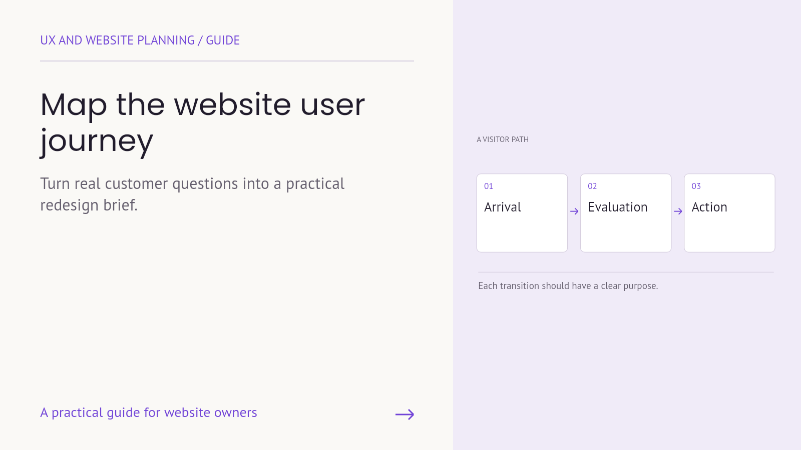
A website redesign often begins with preferences: a cleaner layout, different colors or a more modern homepage. Those choices matter, but they do not explain what the website needs to help a visitor accomplish. Without that understanding, the new site can look different while preserving the same uncertainty.
Website user journey mapping gives the redesign a more useful starting point. It connects a visitor’s goal with the questions, pages, decisions and handoffs involved in reaching it. The result is not a prediction that everyone follows one route. It is a structured way to identify what needs to be understood, tested and improved.
A journey map is not a sitemap
A sitemap describes the pages and their organization. A journey map describes an experience from the person’s point of view. It may begin before the website visit and continue after a form submission, purchase or support request.
Nielsen Norman Group’s introduction to journey mapping explains the role of a specific actor, scenario and sequence of activity. For a website project, that means choosing whose experience you are examining and what they are trying to achieve before filling a diagram with page names.
Both artifacts are useful. The journey helps determine the information and actions a person needs; the sitemap helps organize where that information lives. Neither should be treated as evidence that visitors behave exactly as the team expects.
Choose one audience and one realistic task
“Everyone who visits the website” is too broad for a useful first map. A prospective customer comparing service providers has different questions from an existing customer trying to find support.
Choose a task that matters to the business and the visitor. For example: a service-business owner needs to evaluate ongoing WordPress support and ask whether it fits their current site. This is an illustrative scenario, not research about Armada’s customers.
Define the starting situation, what the person needs to accomplish and what a successful outcome would look like. Avoid inventing demographic details that do not affect the task. The person’s decision context is usually more useful than a fictional name or stock portrait.
Separate what you know from what you assume
Useful inputs can include recurring sales questions, support requests, search information, page behavior and observations from usability sessions. Each source has limits. A page exit does not explain a person’s motivation, and one interview does not describe every visitor.
Label map entries as observed, reported or assumed. Attach enough context to understand where the information came from. For example, “prospects ask what maintenance includes” is stronger when linked to a reviewed set of inquiries than when it reflects one person’s memory.
Use aggregated or appropriately anonymized information when sharing the map. It rarely needs customer names, private account details or full message histories. Keep the evidence relevant to the decision the team needs to make.
Map the questions between arrival and action
Arrival: what context does the visitor bring?
A referral, a search result and an advertisement may create different expectations. Note the likely entry page and the information the person already has. Someone arriving directly on a service page should not need the homepage to understand the offer.
Understanding: what does this page need to explain?
Write the visitor’s next question in ordinary language. “Does this service cover ongoing maintenance?” gives the content team a clearer task than “increase engagement.” Identify the information needed to answer that question and remove unrelated detours from the immediate path.
Evaluation: what helps the person judge fit?
A service page may need scope, responsibilities, process and genuine evidence. A product page may need dimensions, compatibility and delivery information. Choose the material that supports the actual decision rather than adding the same trust section to every page.
Action: what is an appropriate next step?
Not every visitor is ready to book a conversation. A useful next step might be reading a relevant guide, comparing service details or asking a specific question. Give the primary action visual priority while keeping necessary supporting routes available.
Handoff: what happens after the action?
Include the confirmation, receipt, routing and follow-up process. A well-designed contact page cannot compensate for an inquiry nobody owns. Check what the visitor is told and what the receiving team can actually deliver.
Turn the map into page responsibilities
Consider this illustrative route: a visitor reads an article about a slow WordPress site, opens a relevant support service page and submits an inquiry. The article helps explain the problem. The service page explains fit and scope. The form gathers the information needed to continue the conversation.
Each page has a different job. The article does not need to become a complete sales brochure, and the service page does not need to reproduce the entire technical guide. Descriptive links can connect them without forcing every visitor through the same sequence.
For every priority page, document its audience task, main question, required content, relevant evidence and primary action. This makes the map useful to writers, designers and developers rather than leaving it as a workshop artifact.
Validate a task, not a preferred layout
Ask people who reasonably match the intended audience to try a realistic task. Avoid giving away the route in the instruction. “Find out whether this service could cover your site’s ongoing maintenance” leaves room to observe how someone explores. “Click Services, then Maintenance” mostly checks whether they can follow directions.
Guidance on usability-test task scenarios emphasizes realistic goals rather than leading instructions. Observe where participants hesitate, what they interpret incorrectly and what they expect to happen next. Do not explain the page while they are trying to understand it.
Include mobile use when it matters to the audience. Check the route through to confirmation using a safe test process. A small set of observations can reveal issues to investigate, but it should not be presented as a statistically representative conversion forecast.
Prioritize the gaps before choosing visual details
Separate a cosmetic preference from a task problem. “We would prefer a different hero image” is different from “visitors cannot determine whether this service includes support.” Both may lead to design work, but they need different evidence and acceptance checks.
For each gap, record its effect on the visitor, the evidence available, the proposed change, an owner and a way to check the result. Consider impact, confidence, effort and dependencies when choosing what to do first. An unclear service description may be easier to fix than a major navigation change and may resolve the more immediate problem.
What a useful redesign brief should contain
- The priority audience and task, including the starting context.
- The important questions and uncertainties across the route.
- The role of each page and the content it needs.
- Evidence the business can legitimately use to support claims.
- The main action, confirmation and internal handoff.
- Technical or operational dependencies and their owners.
- The observations or tests that will be used to review the new experience.
This brief still leaves room for creative design. It gives the design a purpose and provides a shared basis for evaluating proposals beyond personal taste.
Bring one real journey to your next website conversation
A first map does not need to cover every visitor. Start with one valuable task, challenge the assumptions and improve the map as evidence becomes available. The most useful version is the one that helps the team make a better decision.
Armada’s website creation service includes discovery, content planning, visual direction, development and testing. Contact Armada with one customer journey and the questions your current site leaves unanswered to begin a more focused redesign conversation.
