
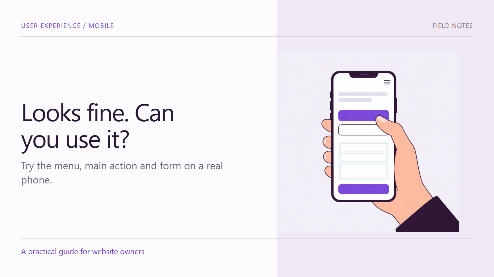
A website can fit a phone screen and still be difficult to use. A menu may open beneath another panel. Two links may sit too close together. A form may become awkward as soon as the on-screen keyboard appears. These problems are easy to miss when a review stops at a static screenshot.
Mobile website usability is better examined through a task. Choose something a visitor needs to accomplish, then follow the route on a real device. This guide provides a practical first review for a business team. It does not replace broader accessibility testing or research with the people who use the site.
Choose a task with a clear finish
Use a realistic instruction such as “Find out whether this service suits your needs and ask a question.” Avoid instructions that prescribe every click. You want to notice whether the page makes the route understandable, not simply prove that a reviewer can follow a script.
Record the device, browser, entry page and relevant conditions. If a form submission is part of the task, agree on a test method with the receiving team. Do not send misleading inquiries or make unintended purchases. Define the stopping point before beginning.
Start with navigation
Open the menu, choose a destination and return. Check whether menu labels explain the available routes and whether the close control is easy to find. Include a longer page so you can inspect navigation after scrolling, not only at the top.
Look for overlapping elements. Consent panels, sticky actions and support widgets can compete for a small viewport. An element that is helpful on its own may obstruct another essential control when both appear. Capture the combination of states that produces the issue.
Inspect touch controls without turning a thumb into a standard
Try the main action and nearby links. Notice accidental taps, uncertainty about which area is interactive and controls that require unusually precise movement. The size of a person’s hand is not a conformance test, but it can reveal a practical problem worth investigating.
W3C’s target-size guidance addresses target dimensions and spacing, including defined exceptions. Use the full criterion when assessing conformance. Do not reduce accessibility to a blanket claim that every button above one size is acceptable or every smaller link is a failure.
Read with larger text and a narrow viewport
Increase text size or zoom through the device and browser’s supported controls. Check whether content remains understandable, whether labels are cut off and whether a sticky element covers the information you need. Inspect the actual words, including long service names or translated content where relevant.
W3C’s guidance on reflow explains how content should adapt when the available reading area becomes narrower, with exceptions for content that genuinely needs a two-dimensional layout. For a first business review, record any loss of information or functionality and have the implementation assessed against the relevant requirements.
Open the keyboard and complete the form
The on-screen keyboard changes the available space. Select a field and check whether the label, entered value and next action remain usable. Move through the form rather than testing only its first field. Review dropdowns, date controls and any verification step that belongs to the real route.
Ask whether each requested detail is necessary for the next business step. W3C’s forms tutorial emphasizes clear identification, instructions and feedback. A concise form still needs enough context for a person to understand what is required.
Include an error and a successful finish
Through the agreed test process, leave a required field empty or enter a harmless invalid value. Check whether the page explains the problem and lets you correct it without losing unrelated work. Then complete a valid test and inspect the confirmation.
For example, an illustrative inquiry flow might display an error at the top while leaving the invalid field below the keyboard. The issue record should describe that sequence, not just say that the form is “not mobile friendly.” Do not assume the technical cause from the visible symptom.
Turn observations into useful fixes
Keep each finding small enough for someone to reproduce. Include the task, device, page state, action taken, observed result and expected result. A screenshot or short screen recording can support the description, provided it does not expose private data.
Prioritize barriers to completing the task before cosmetic preferences. An unreadable confirmation or blocked submit action may be more urgent than an awkward line break. Assign an owner and repeat the same route after the change. Also check nearby behavior that could have been affected.
Know what the review does not prove
One device and one reviewer cannot represent all visitors. A thumb test does not cover screen-reader use, switch input, keyboard access, contrast or the full range of accessibility requirements. Treat the findings as evidence about the tested conditions, not a certification or a forecast of revenue improvement.
Use the first review to select the next investigation. Broaden the devices, tasks and participants according to the audience and the risks the initial review reveals.
Make the mobile journey usable from start to finish
Contact Armada with your mobile page and the task visitors need to complete to discuss a focused review of the obstacles between arrival and action.
