
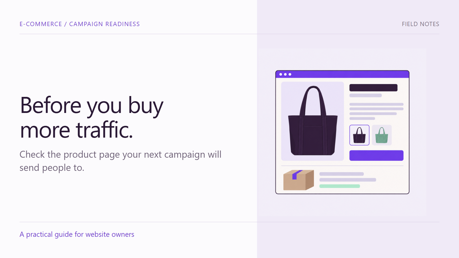
A campaign can send the right visitor to the wrong buying experience. The advertisement features one color, the product page opens on another, delivery costs are unclear, or the selected option changes when it reaches the cart. None of these problems is visible in a polished campaign mockup.
A product page audit is a practical review of the information and controls that connect a campaign promise to a purchase. Before launch, the aim is to identify blockers, assign corrections and retest the same customer task. This guide focuses on that release check, rather than a complete redesign or a prediction of conversion results.
Set up a repeatable product page audit
Choose an item that will actually be promoted. Record the campaign link, product, variant, destination market and device. If the campaign covers materially different product types, select a representative item from each relevant journey rather than assuming one check covers the whole store.
Agree on a safe test route with the store team. Adding an item to a cart is different from placing an order. If payment or order processing needs testing, use an approved test environment or documented test procedure so you do not accidentally charge a card, reserve scarce stock or trigger fulfillment.
1. Compare the page with the campaign promise
Start from the actual campaign URL. Check that the item, offer and variant match what the visitor was shown. A campaign that promotes a particular bundle should not leave the buyer to infer which accessories are included.
Review the gallery for useful angles, relevant detail and a sense of scale. Distinguish props from included items. In an illustrative bag campaign, a photograph beside a laptop may suggest size, but the product still needs verified measurements and a clear statement about what is included. Do not infer specifications from the image.
2. Change the options and inspect the result
Select each important option combination. Watch the image, availability, price and purchase control. Then add an eligible option to the cart and verify that the same choice appears there. Include an unavailable combination if the store has one, and check that the resulting explanation is understandable.
A useful issue report is specific: “On the mobile page, selecting the mint option changes the label but leaves the violet image.” This is an illustrative issue, not a finding about your store. It tells the owner where to investigate without prescribing an unverified technical cause.
3. Make the cost understandable before checkout
Look for the information a buyer needs to judge the likely total. Check delivery charges or an estimation method, minimum-spend conditions, bundle limitations and any campaign code instructions. Where a final amount depends on location or configuration, explain that dependency rather than showing an unsupported universal price.
Baymard’s research on product-page shipping costs identifies the importance of making delivery costs available during product evaluation. Apply that principle to your actual shipping model: a reliable estimate or clear calculation route is more useful than leaving the question unanswered.
4. Separate dispatch from arrival
Check whether the page describes when an order leaves the business, when it is estimated to arrive, or both. Those are different expectations. Review geographic restrictions and any product-specific handling requirements against the current fulfillment process.
For a limited campaign, assign someone to confirm the delivery message when stock or operations change. Do not preserve an outdated estimate merely because it is embedded in an attractive banner. Keep essential conditions in readable page content, not exclusively inside an image.
5. Inspect the evidence beside the decision
Product details and customer feedback should help answer a real buying question. Check that reviews belong to the relevant product or are clearly identified if they concern a broader service. Do not invent feedback to complete a layout or treat a decorative rating graphic as evidence.
Verify material claims with the responsible product owner. A claim about compatibility, performance or included accessories should have a dependable basis. If the information cannot be confirmed before launch, narrow the wording or resolve the uncertainty rather than presenting a guess as fact.
6. Complete the mobile route
Use a real phone to open the campaign link, inspect the item, choose an option and reach the cart. Check whether sticky bars, consent panels or chat controls obscure the purchase action. Test the controls themselves; a screenshot only shows one state.
Inspect the cart contents, not just the success notification. Confirm the option, quantity and displayed price. If the scope includes checkout, follow the agreed safe test procedure and record where the route stops. “Cart checked” should not be reported as “checkout verified.”
Turn findings into a launch decision
Use a short issue record with the observed behavior, expected behavior, affected item, device, owner and retest result. Separate a purchase blocker from a content improvement that can be handled later. The campaign owner and store owner should understand what remains unresolved.
- Blocker: a required option cannot be selected or the wrong item reaches the cart.
- Important clarification: a delivery condition is missing or ambiguous.
- Follow-up improvement: an additional useful photo is available but not yet included.
These are illustrative categories, not automatic rules for every store. Make the decision using the actual impact and business constraints. After a correction, repeat the original route and any closely related behavior that could have changed.
Give your campaign a checked destination
A pre-launch review creates a clearer list of work and reduces avoidable uncertainty. It does not guarantee sales or replace ongoing analysis after launch.
Contact Armada with your campaign destination, promoted product and intended customer task to discuss a focused review before the next campaign goes live.
